Ear Health Cork, led by Dr. Catherine Buckley, is a medical clinic specialising in Ear, Nose, and Throat (ENT) care. This project aimed to develop a comprehensive brand identity reflecting the clinic’s expertise, reliability, and dedication to patient care. The objectives were to enhance brand recognition, establish a trustworthy and professional image, and create a cohesive visual and verbal identity for the clinic.
This project highlights the importance of a well-executed brand strategy in establishing trust and professionalism in the healthcare sector. We are proud to have worked with Dr. Catherine Buckley to bring her vision to life.
In the research and discovery phase, we conducted extensive market research and audience analysis, examining competitors, understanding the target demographic, and identifying the key needs and preferences of potential patients. Key insights revealed that the target audience values trust, professionalism, and modern, high-quality care. These findings informed the development of a brand strategy positioning Ear Health Cork as a leading provider of ENT services in Cork.
BRAND POSITIONING
Defining Ear Health Cork positioning involved understanding the vision, mission, and values. The vision is to be the go-to clinic for ENT care in Cork, while the mission is to provide exceptional ear health services with compassion and expertise. Core values include excellence, empathy, trustworthiness, and innovation. The unique value proposition emphasises state-of-the-art equipment and personalised care, differentiating Ear Health Cork from competitors by highlighting its specialised services and patient-centred approach.
BRAND IDENTITY DESIGN
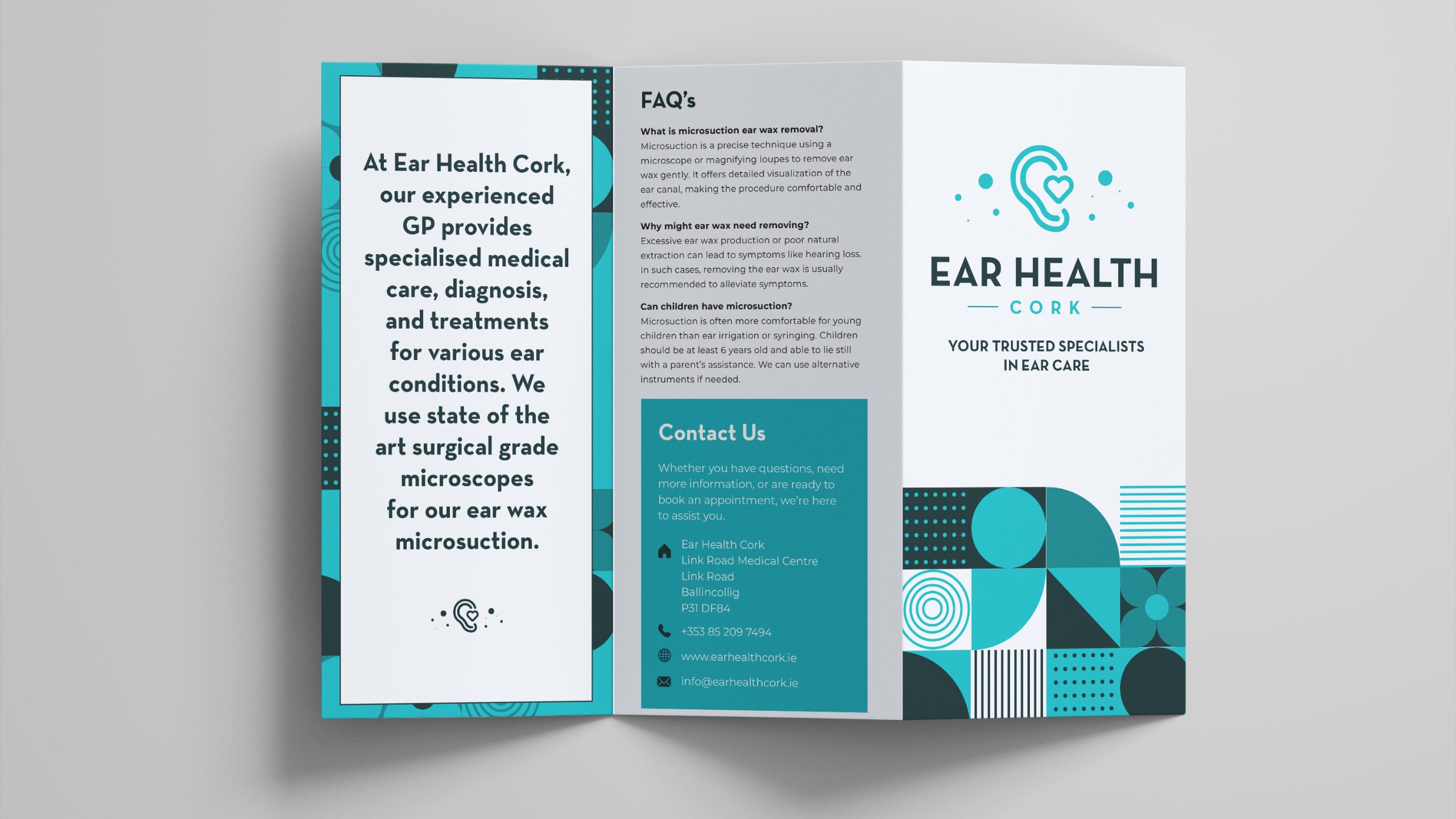
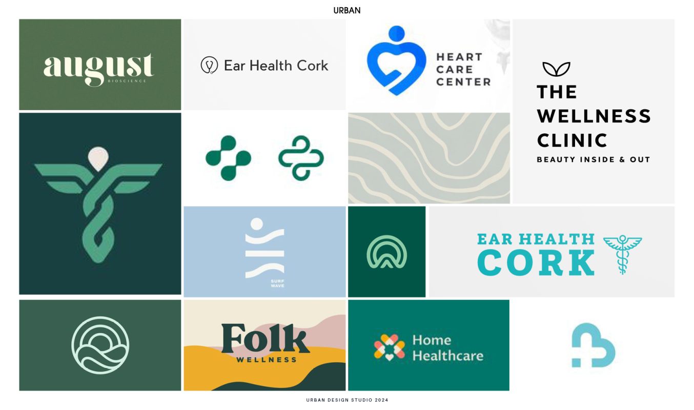
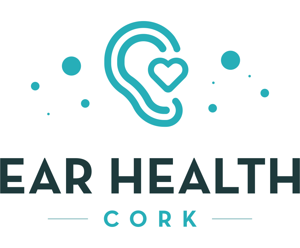
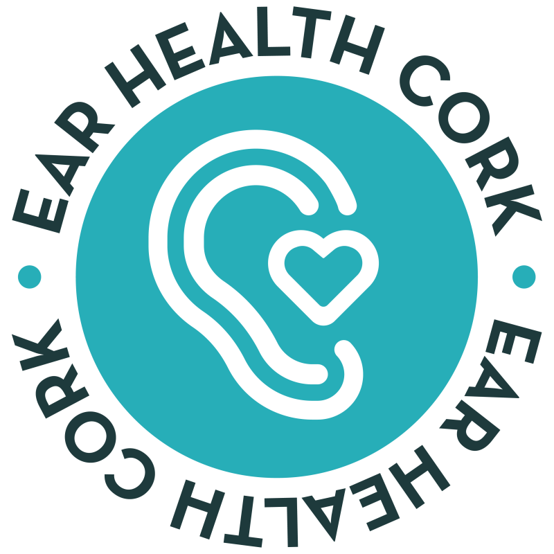
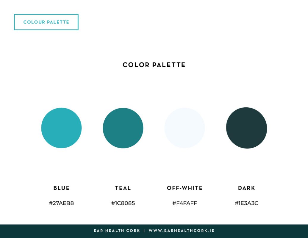
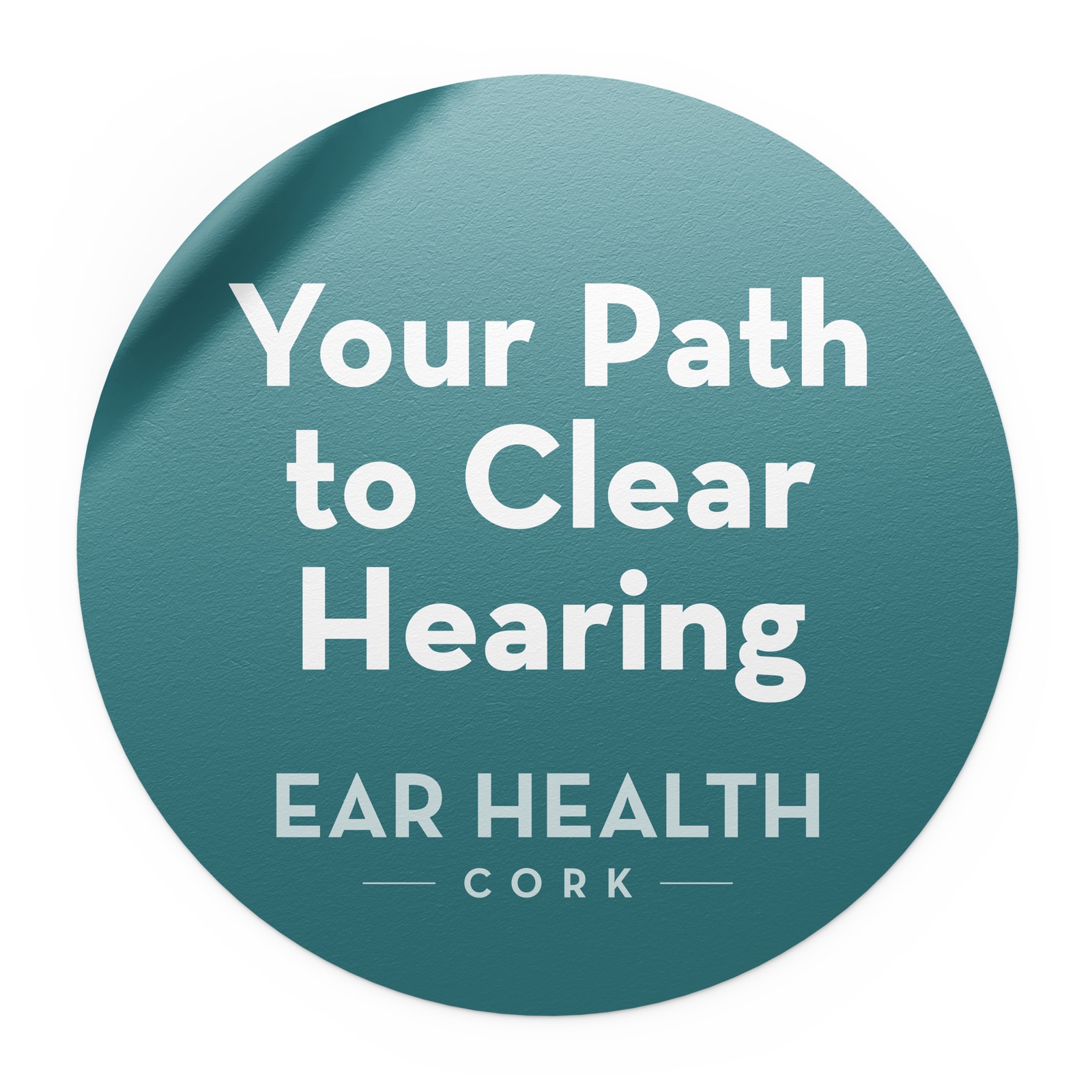
The logo design process involved creating a clean, contemporary logo symbolising the clinic’s focus on ear health and advanced medical care. The final logo features a modern design with elements representing the ear and heart, conveying professionalism and care. The chosen colour palette includes shades of blue and teal, evoking trust, professionalism, and modernity. Simple and straightforward typography was selected to reflect the clinic’s clean and contemporary aesthetic.
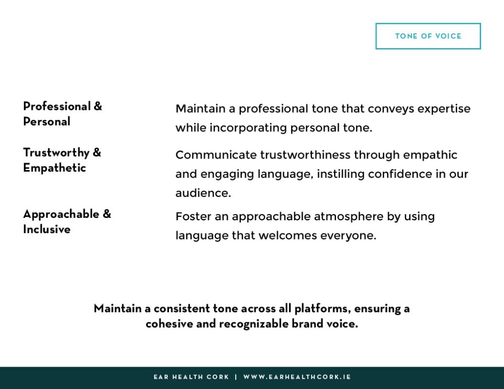
BRAND VOICE & MESSAGING
The tone of voice for Ear Health Cork was established to be professional, compassionate, and informative. Key messages were crafted to communicate the clinic’s expertise, advanced solutions, and patient-focused care. Examples include, “Experience expert ear care with our state-of-the-art equipment,” and “Trust us for comprehensive solutions to all your ear health needs.” These messages effectively convey the brand’s value proposition and benefits, ensuring clear and consistent communication with the target audience.
BRAND GUIDELINES
Comprehensive brand guidelines were developed to ensure the consistent application of the brand identity. Key aspects include detailed instructions on logo usage, colour schemes, and typography. The guidelines also cover the use of visual elements, tone of voice, and messaging, providing a complete framework for maintaining the brand’s integrity across all touchpoints.
IMPLEMENTATION
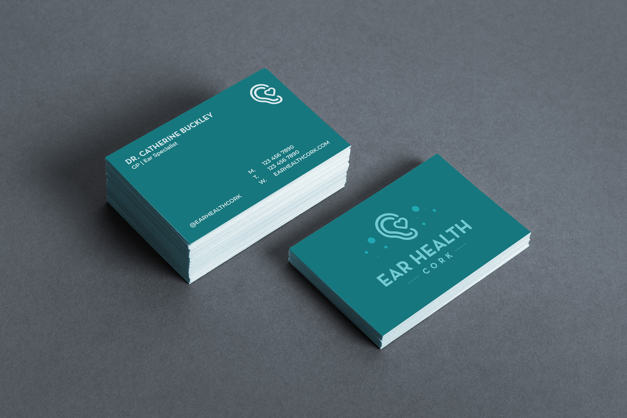
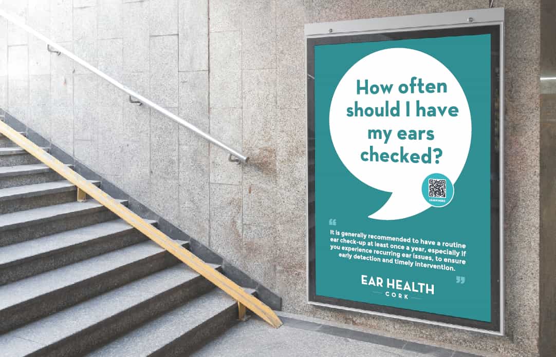
The implementation phase involved creating a range of marketing collaterals, including business cards, brochures, and signage, as well as designing and developing a user-friendly website. All branded assets were crafted to reflect the new brand identity, ensuring a consistent and professional presentation. The website features intuitive navigation, clear calls to action, and informative content, enhancing the overall user experience.
CONCLUSION
This project highlights the importance of a well-defined and executed brand strategy in establishing a strong market presence and building trust with the target audience. By following a systematic approach, this project has led to a cohesive and professional brand that has significantly enhanced the clinic’s visibility and credibility.
We use cookies to ensure that we give you the best experience on our website. If you continue to use this site we will assume that you are happy with it.